Marketing with Adobe |
ILLUSTRATOR |
Adobe Illustrator makes working with text especially easy; so, I decided to use Illustrator to create the major textual and graphical elements. Starting with the headline, I opened Illustrator and added a new layer for “NUTS!” Each new element on the artboard was created in its own layer.
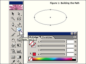
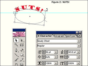
Since “NUTS!” is such an important visual component of the project, the text had to be eye-catching—big, bold, and colorful. Placing the letters along a curved path would also help to catch the immediate attention of even a casual web surfer. I used Illustrators' Ellipse Tool to draw a curved path for the text: stroke and fill were disabled (Figure 1). After drawing the path, I was ready to use the “Type on a Path Tool” to place the text along the path. From the Type/Font menu, I reviewed the available fonts and selected 36 pt Goudy Stout; and, using a red fill for the text, I typed the text along the curved path. I used the Selection Tool to position and rotate the text as I wanted (Figure 2). Using a ruler guide helps while positioning objects on the artboard (one of these is shown in Figure 2).
 |
 |
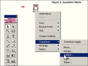
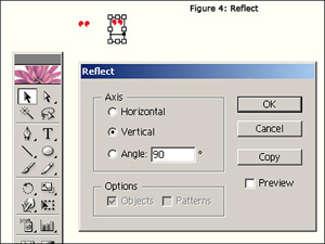
I created the quotation marks for “NUTS!” on a separate layer so I could place them around the text with non-standard positioning. After typing the first quotation mark, I duplicated it with a copy and paste. I transformed the duplicate into the right quotation mark with a vertical reflection (Figures 3 and 4).
 |
 |
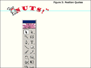
I roughly positioned the quotation marks using the Selection Tool and used the arrow keys to position them precisely (Figure 5). Next, I created the text for “BREAKOUT NOW!”
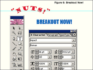
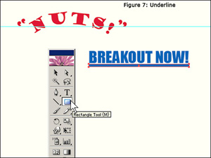
“BREAKOUT NOW!” consisted of two components: the text and a graphical underline. For the text, I selected 36 pt Impact and filled it blue (Figure 6). I created the underline by simply drawing a thin, appropriately-sized rectangle with the Rectangle Tool and filling it with blue (Figure 7).
 |
 |
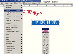
In order to move the text and graphic as a block, I used the Selection Tool to select both and then used the Object/Group menu option to group them together (Figure 8).
Using the Selection Tool, I moved both the breakout text and the underline into position next to “NUTS!”. The combination of text and graphic gave the breakout part of the headline the appearance of a URL link: later, I would associate the entire headline with the URL of the targeted web page. I selected all five headline elements—right and left quotation marks, NUTS!, BEAKOUT NOW!, and the underline) and grouped them together so I could move the headline as a block.
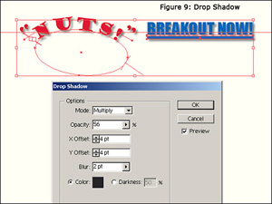
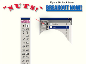
After grouping the elements, I placed a drop shadow under the headline in order to make it stand out even more (Effect/Stylize/Drop Shadow..., Figure 9). I protected my work on the headline by locking the layer. This is indicated by the small padlock shown in the headline layer (Figure 10). Locking a layer prevents accidental alteration as the work continues.
 |
 |
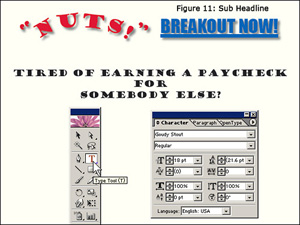
I created the sub headline using 18 pt Goudy Stout, filling the text black. I used the standard Type Tool for this and moved the text into place with the Selection Tool (Figure 11).
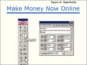
The breakout opportunity, “Make Money Now Online,” was created in a similar manner as the “BREAKOUT NOW!” of the headline. It consisted of text (36 pt verdana) and a graphical, rectangular underline (Figure 12). The text and underline graphic were grouped together and the block was placed into position using the Selection Tool.
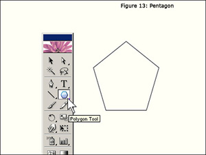
The 5-star graphic was created by first drawing a pentagon to use as a guide for star placement (figure 13). I created a new layer and used the Polygon Tool to make a pentagon—what other polygon could be more appropriate for this project?
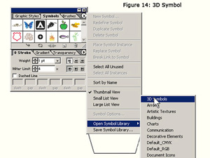
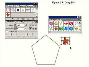
Next, I created a new layer, above the pentagon, for the stars. From the symbol palette, I opened the symbol library and selected a star from the 3D Symbols palette and dragged it onto the artboard (Figures 14 and 15).
 |
 |
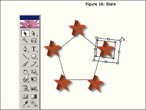
After applying a drop shadow to one star (Effect/Stylize/Drop Shadow...), I copied/pasted the star four more times onto the star layer. Using the pentagon on the layer below as a guide, I positioned the stars (Figure 16). Again, I used the arrow keys for precise positioning. I selected all of the stars with the Selection Tool and grouped them from the Object/Group menu. This grouping allowed me to move the stars as a block in order to place them below the breakout text.
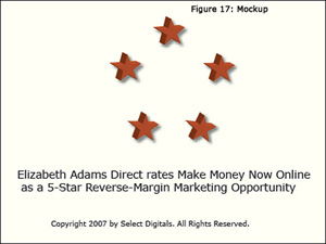
At this point, the major elements of the design were complete. In order to visualize what the component-5 text would look like in a web page, I added mockup text (Figure 17).
I saved the project as nuts.ai. The remaining work on the graphic design was done in Photoshop CS2.