Presenting easy-to-read WordPress posts takes a little practice and some trial-and-error styling. This short tutorial reveals some of the styling techniques I use.
The main techniques I use include the following:
- paying attention to the post title,
- writing relatively short paragraphs,
- micro-bolding,
- using lists, where appropriate,
- special section styling,
- formatting for image captions, and
- giving special attention to image display.
I try hard to make my posts easy on the eyes and to help the eyes move from paragraph to paragraph. I sometimes think the eyes, like the brain, prefer to take in “chunks” of information. Presenting information in meaningful pieces is, I believe, more effective than confronting a reader’s eyes with an unbroken sea of text. The first and most important “chunk” of a post is, of course, the title.
WordPress styles the title in large, bold text—and I add color to the title, as well. If the title is good, a reader can absorb the main point of the post—at a glance.
When a visitor first finds your blog post, your hard, creative work might get just a glance. In that first glance, the title must be compelling enough to entice the visitor into reading further.
Headline Analyzer is an online tool that can help you create compelling titles for your posts. My first title for this post was, “Styling Tips for WordPress Posts.” This title received a score of 0.00%: the title didn’t involve the reader in any way. After working with the analyzer tool for awhile, I arrived at the present title, which received a score of 60%. Which title seems more compelling to you?
Mostly, I use short paragraphs to convey the post content; and once the title has captured the the reader’s attention, I help the reader navigate deeper into the post by bolding the first few words of the next paragraph.
“Micro-bolding” means bolding the first few words of a paragraph to help the reader’s eyes move from paragraph to paragraph. More and more, I style the beginning of every paragraph in my articles and posts this way. I have not always done this. You will see a lot of content on my sites with, and without micro-bolding. I think that when you have a chance to read content of each type, you will find the micro-bolded content more inviting and easier to read.
I also use lists to make it easy for a reader to find and absorb important content. List items, set off from the main text body with their bullets or numbers, help the reader focus on important content and absorb it quickly and easily.
Besides using lists and micro-bolding, I sometimes divide longer posts into sections. I style the section headers in my theme’s style.css file.
The following CSS and XHTML code show how the section header, just below this paragraph, was styled and displayed.
Here is the CSS code I used for the section header:
.section {

/*Text inside the paragraph will be left aligned.*/

text-align:left;

/*Color the text and border maroon.*/

color:maroon;

/*Set the font size.*/

font-size: 1.2em;

/*Section title will be bold.*/

font-weight:bold;

/*Set the border style.*/

border-top: double;

/*Set the space between the title and the top border.*/

padding-top:2em;

/*Title will be italic.*/

font-style:italic;

/*Set a fixed space above the top border.*/

margin-top:2em;

/*Set a fixed space below the (hidden) bottom border.*/

margin-bottom:2em;

}
.finalsection {

text-align:left;

color:maroon;

border-top: double;

margin-top:3em;

margin-bottom:2em;

}
Here is the XHTML code for the section header:
<div class="section">Styling A Section Header</div>
If you visualize the section header as being just a box with some text in it, it will help you understand the styling. There is a border around the box and spacing above and below the box (margins). Only the top border is displayed. Inside the box, there is a left-aligned section title. The styling fixes the space between the title and the top border (padding). The border and the text are maroon.
The CSS for .finalsection provides only a double border at the end of the post: no title is needed there. Here is the XHTML code for the final section header:
<div class="finalsection"> </div>
If you use the TinyMCE editor, and you add an image, you can also add an image title and caption. I prefer to use my own styling for captions and for image display. Here is the CSS code I use for a centered image:
/*This code centers an image caption*/

.centercaption {

padding-top:1em;

color: #000000;

text-align:center;

font-size:1em;

margin-bottom:.5em

}
/*This code centers an image*/

img.displayed {

display: block;

margin-left: auto;

margin-right: auto;

margin-top: 1em;

margin-bottom:2em;

}
Here is the XHTML code I use for the centered image and caption (Figure 1):
<div class="centercaption"><strong>Figure 1:</strong> Techniques for Styling a Post</div>
<img class="displayed" src="/images/styling-posts/1.gif" alt="Techniques for Styling a Post" />
Left and right-aligned images take a little more attention to display them neatly—particularly if you desire to add captions.
Here is the CSS and XHTML code I use for a left-aligned image with caption (Figure 2):
/*Position an image caption to the left*/

.leftcaption {

color: #000000;

text-align:left;

font-size:.75em;

padding-top: 1em;

}
/*Position image to the left*/

img.left {

float: left;

padding-top:.5em;

padding-left: .5em;

padding-right: 1.75em;

}
<div class="leftcaption"><strong>Figure 2:</strong> Left Caption</div>

<div><img src="/images/styling-posts/4.gif" alt="Left" class="left" /></div>
A right-aligned image with caption (Figure 3) uses this CSS and XHTML code:
/*Position an image caption to the right*/

.rightcaption {

color: #000000;

text-align:right;

font-size:.75em;

padding-top: 1em;

}
/*Position image to the right */

img.right {

float: right;

padding-top:.5em;

padding-right: .5em;

padding-left: .5em;

}
<div class="rightcaption"><strong>Figure 2:</strong> Right Caption</div>

<div><img src="/images/styling-posts/4.gif" alt="Right" class="right" /></div>
Small images with captions might need extra attention to make them look presentable.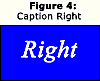 If the image and caption is going to be placed anywhere but at the top of the paragraph, it is probably better to include the caption as part of the image (Figure 4). You might also want to use this technique if it is important to have an image with caption at exactly the same level as the first line of a paragraph. Because I use left-aligned text in my paragraphs, the text doesn’t always flow around right-aligned images as neatly as I’d like.

A small image at the top of a paragraph (Figure 5) does not present the same problems as the image above (Figure 4). However, in placing and styling your image and caption, you might need to modify the CSS code to get the results you want. Sometimes, styling images and captions is a trial-and-error process for me: I try some styling modification and then “preview” the results to verify that I have achieved the look I want.
In a post of this sort, with lots of code, and where there are several images and captions of various sizes and alignment-types, micro-bolding the first few words of a paragraph can really help the reader navigate from paragraph to paragraph, don’t you agree?
Using styling techniques, like micro-bolding, in order to make posts easier to read, does takes a little extra work. At the very beginning, the title must be carefully crafted in order to be compelling enough—with just a glance—to entice the reader further into the post. Micro-bolding can help the reader move from paragraph to paragraph. Using short paragraphs and lists can help present your content in small pieces, or “chunks,” that can be absorbed with greater ease—even if your reader just skims the post. Together, the techniques I have touched on in this short tutorial can help you write quality posts with style.